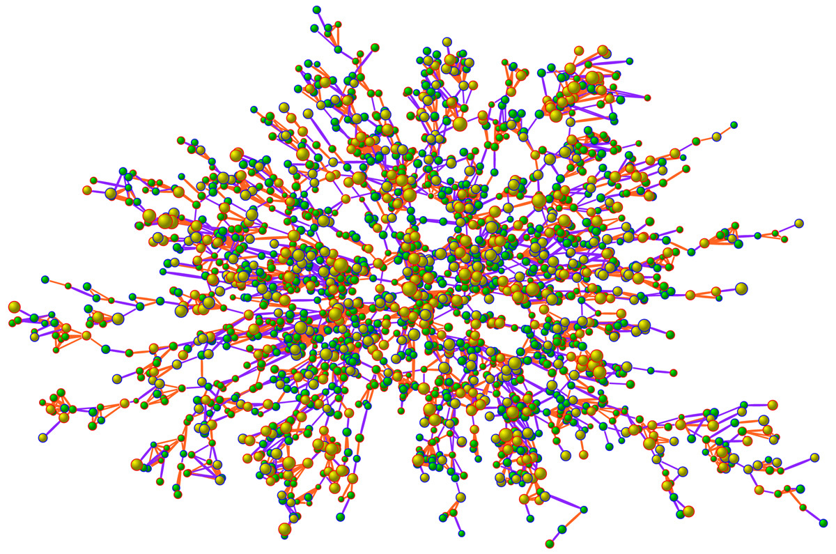
Obesity in a Face-to-Face Network in 2000
This graph shows the largest connected subcomponent involving 2,200 individuals in 2000 from the Framingham Heart Study Social Network. Each node represents one person. Nodes with blue borders are men and those with red borders are women. The size of each node is proportional to the person’s body-mass index. The interior color of the circles indicates the person’s obesity status: yellow denotes an obese person (body-mass index, ≥30) and green denotes a non-obese person. The colors of the ties between the nodes indicate the relationship between them: purple denotes a friendship or marital tie and orange denotes a familial tie (e.g., siblings). Clusters of obese and non-obese individuals are visible in the network, as confirmed by mathematical models discussed in the paper. These clusters are not only due to individuals of similar body size preferentially forming ties, but also due to influence, whereby one person’s body size affects that of another. For more details, see: N.A. Christakis and J.H. Fowler, “The Spread of Obesity in a Large Social Network Over 32 Years,” New England Journal of Medicine 2007; 35: 370-379.